Ganzeer Rebrand
Branding
2024.09
Houston, TX


Ink, paper, and Adobe Illustrator
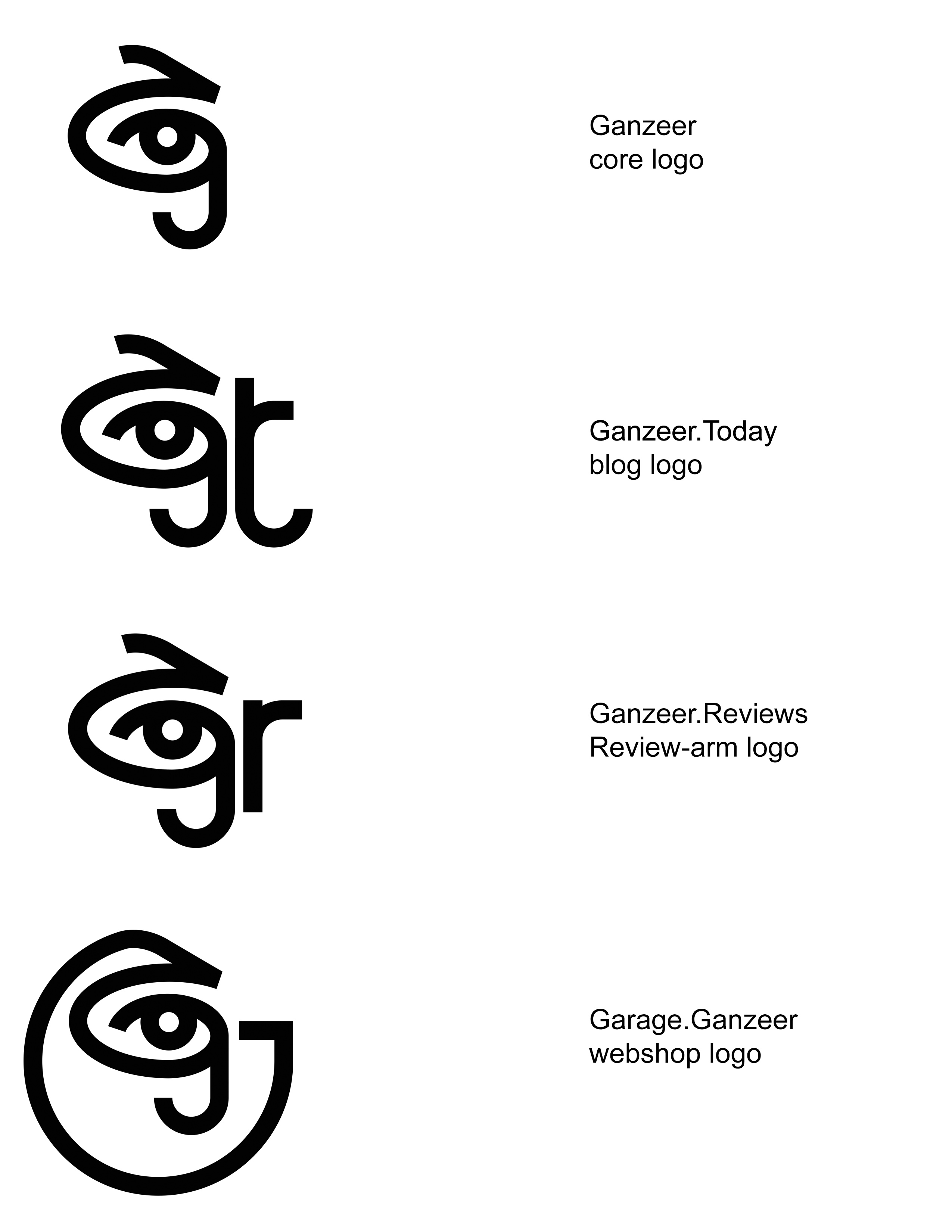
Aside from the obvious eye, the logo is also comprised of 3 letterforms (as was the previous one), G, J and the Arabic letter ج. The G being the first letter in Ganzeer of course, as the ج is in جنزير (Ganzeer in Arabic). The thing about the letter ج though is that it is only pronounced a hard G in Egypt and pronounced J in literally every other Arabic dialect. Which means جنزير will often be pronounced Janzeer when I'm in touch with Arabic speaks who hail from not Egypt, so the logo is able to represent all possible phonetics in one single symbol. It's as complex as it is simple.
The eye may be a cliche, but fact of the matter is everything I do—be it art, design, or writing—stems from one unshakable trait: observation. Keen, unwavering observation. Without which I doubt I'd ever have anything worthwhile to say. In any medium, really.
I've always been a fan of the kind of symbols you can't help but want to scrawl on your desk when you're a kid, and I think this logo has an element of that.
The earliest Ganzeer logos I conjured up tended to feature some graphic representation of a chain, because that’s what جنزير actually translates to. So it may seem to some to be a rather curious choice to not represent the chain at all in the latest brand iteration, but I’d like to think that as far as the word “Ganzeer” relates to me, it no longer carries any of its associations with the word chain, and has simply become a name associated with a person who engages in art design and storytelling.
Utilizing my signature together with the logo-form started to feel like a no brainer. Picasso’s signature was very much a part of his brand, as was Andy Warhol’s, as is the case with most visual artists. Why resist it?
Aside from the main dot com, there are three core channels of online activity that each needed a different enough logoform to signal it as its own thing, while still remaining very much related to the Ganzeer “identity”, and so an additional letterform was incorporated into each along the same parameters that informed the original composite glyph. An extra “t” for the Ganzeer.Today blog, an “r” for Ganzeer.Reviews, and a “G” for the Garage.Ganzeer webshop.
