Kamilia
Branding
2024—2025
Houston, TX—New York, NY


Ink, paper, and Adobe Illustrator
Kamilia is a luxury perfume and jewelry brand named in honor of the client’s mother. From its inception, the design process sought to establish a visual identity that would convey the brand’s deeply personal origins while communicating the refined craftsmanship behind its products. The earliest creative direction centered around transforming the mother’s handwritten signature into a bespoke logoform—an intimate gesture that would embed sentiment directly into the brand’s DNA. This approach was envisioned as a way to humanize the identity and give it an immediate sense of authenticity, making the brand feel as hand-touched and genuine as the artisanal goods it represented.
However, when it became clear that neither the client’s handwriting nor her mother’s signature possessed the aesthetic consistency necessary for adaptation into a polished mark, the design vision evolved toward a more typographic solution—one that could preserve the essence of personal handwriting without its imperfections. The typeface Kaileigh 2 was chosen as the foundation for this refined direction. Known for its graceful curvature and organic pen-like motion, Kaileigh 2 carries a believable sense of handcraft while maintaining typographic precision. A lightly customized version was developed to enhance rhythm, flow, and balance, resulting in a logo that feels both intimate and composed, reflecting the dual spirit of Kamilia: personal yet refined.
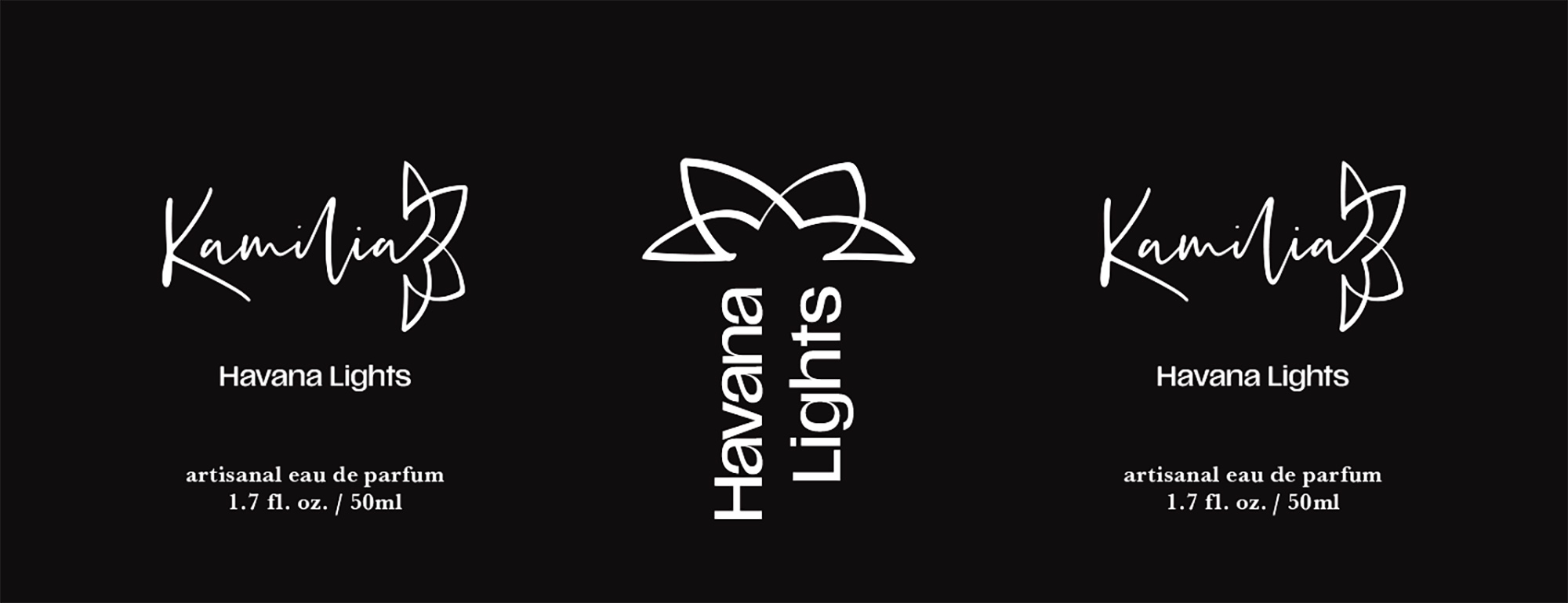
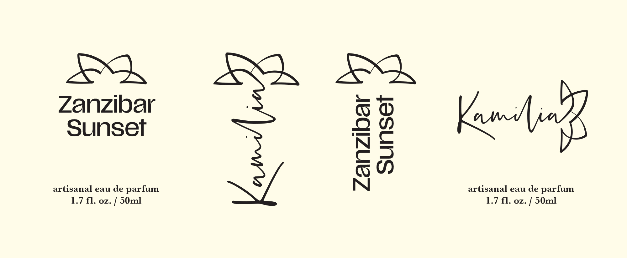
Complementing the logotype is a custom logomark derived from the natural geometry of the Camellia flower—a subtle nod to the name’s botanical counterpart. The form elegantly abstracts the petals of the flower into a free-flowing symbol that simultaneously outlines the letter K, allowing the mark to function as both an emblem and an initial. This layered meaning adds depth to the brand’s visual storytelling, merging nature, femininity, and identity in one continuous line. The result is a mark that feels organic and deliberate, mirroring the sensual, crafted nature of the perfumes themselves.
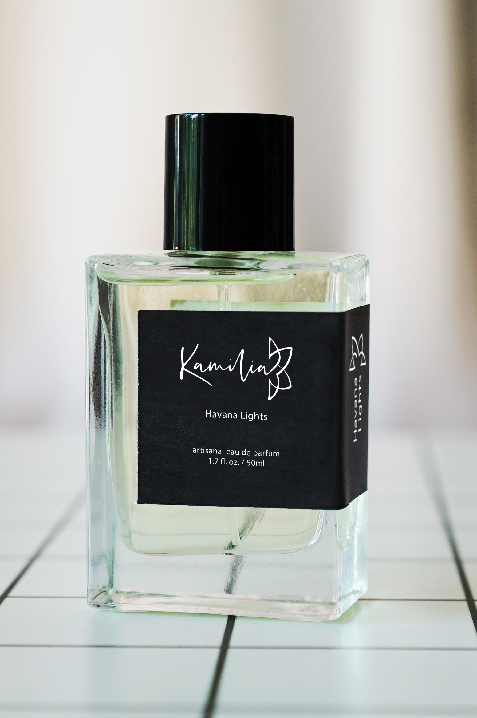
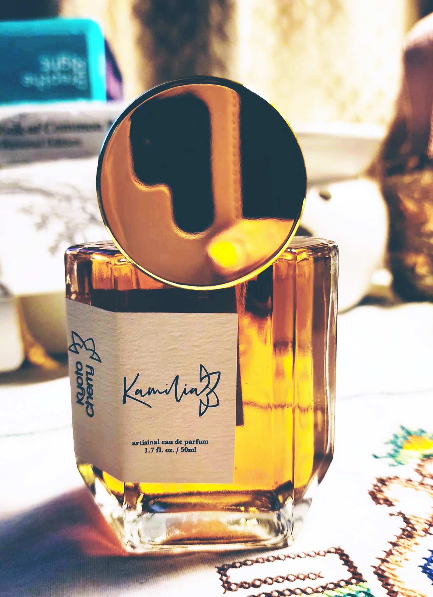
The broader identity system rejects conventional gender labeling—Kamilia does not divide its scents into categories of “for men” or “for women.” Instead, design and color perform that communicative role. The unisex fragrances are identified by white-on-black labels, emphasizing neutrality, graphic minimalism, and a universal sophistication that transcends gendered marketing. In contrast, women’s fragrances adopt a black-on-off-white palette, paired with a more expressive six-sided bottle capped by a bold circular lid. This cap’s smooth geometry and luminous surface introduce a sense of ornamentation and visual drama, contrasting the cleaner, more architectural form of the unisex bottle. Together, the two systems create a dialogue between restraint and exuberance—between quiet luxury and expressive femininity.
Although both bottle designs are mass-produced and widely available, Kamilia’s visual identity transforms their mass-produced forms into something distinct. This transformation is achieved through the label design, which wraps around the bottle’s side rather than sitting symmetrically on its front. The wrap introduces a deliberate asymmetry that breaks from standard perfume packaging conventions, giving each bottle a confident sense of motion and individuality. Beyond its aesthetic impact, the wrapping technique provides a functional advantage: the label remains visible when bottles are arranged side by side, echoing the readability of spines on a bookshelf. This practical yet poetic detail ties into the brand’s underlying philosophy—beauty through thoughtful design.
Typography plays a critical role throughout the identity. While the Kamilia wordmark carries the intimacy of script, the scent names employ Scale VF, a highly flexible variable sans serif chosen for its combination of elegance and clarity. Scale VF’s large counters ensure legibility from a distance, while its dynamic weight range introduces a rhythm reminiscent of calligraphic thick-and-thin strokes. The resulting interplay between Kaileigh’s handwritten grace and Scale VF’s modern geometry produces a sophisticated visual contrast—one that underscores Kamilia’s dual identity as both artisanal and contemporary.
Every design decision—from the curve of the K to the balance of ink and space—was guided by the goal of expressing Kamilia’s essence: refinement without pretension, sensuality without excess, and craftsmanship elevated through simplicity. The final identity system achieves a harmony between personal history and modern sensibility, allowing the brand to inhabit a space that feels both exclusive and emotionally grounded. Through typography, form, and material choice, Kamilia communicates not only luxury, but also intimacy—the quiet story of a name carried forward through conscious design choices.