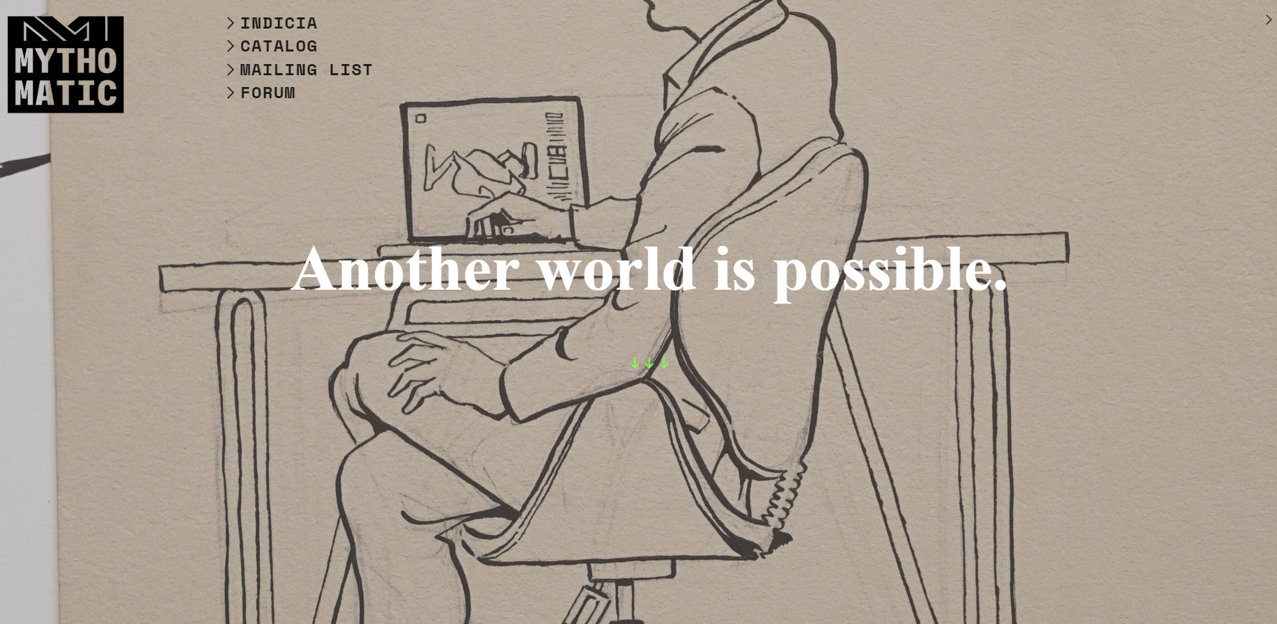
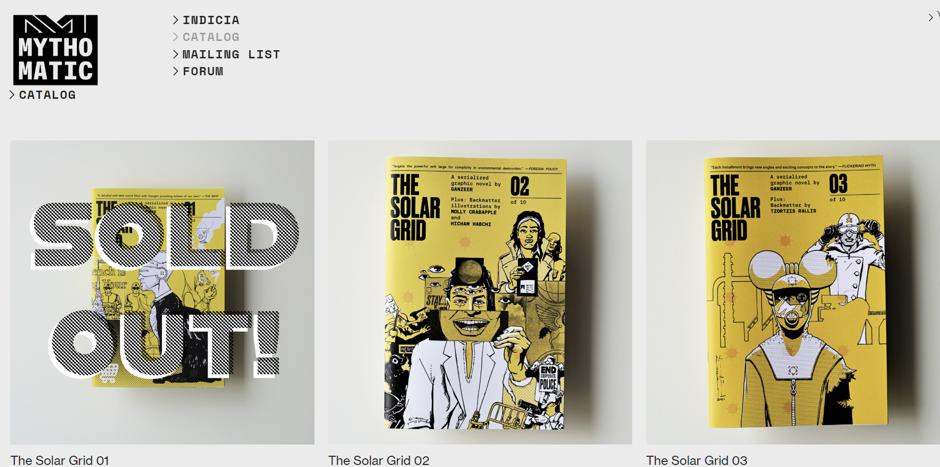
Mythomatic
Branding
2020
Houston, TX


Ink, paper, and Adobe Illustrator
The Mythomatic identity is built around a logo that captures the brand’s dual spirit of imagination and mechanism—its very name suggesting a “mythology machine.” As a boutique publishing imprint focused on narrative-driven works that fuse words and pictures, the visual identity needed to embody both the poetic and the systematic: a sense of story intertwined with structure, invention balanced with precision.
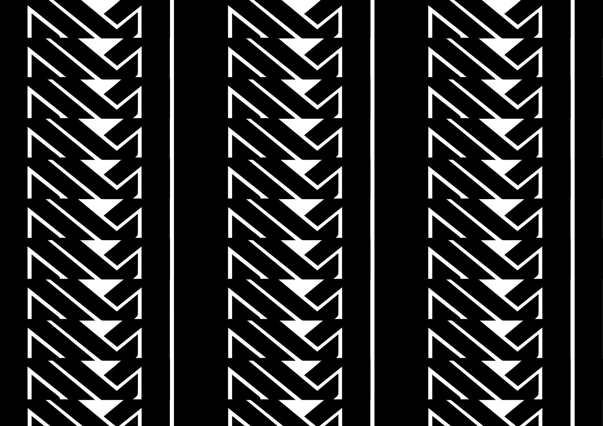
At the core of the logo are two interlocking letter M’s, representing the fusion of Mytho and Matic—myth and mechanism—two halves that together define the brand’s ethos as a myth-making machine. This symbolic “machine” serves as a visual metaphor for the imprint’s mission to consistently produce stories that function seamlessly between text and image.
The geometry of the M’s is clean, modular, and tightly engineered, reflecting the structural discipline behind bookmaking and design. Yet their interlocking symmetry introduces a sense of motion and cooperation—two components working in perfect unison, like the coordination between writer and artist, or between language and illustration. This subtle visual tension—between the organic and the mechanical, the mythical and the methodical—defines the brand’s graphic DNA.
Supporting the logogram is a monospaced typeface, chosen for its rhythmic steadiness and mechanical regularity. The fixed spacing of each character evokes the methodical beat of a typewriter or the even pulse of a production system, reinforcing the concept of a mythology machine at work. This deliberate typographic restraint allows the precision of the wordmark to contrast with the more dynamic interlocking symbol, creating a balance between expressive identity and functional clarity.
The logogram itself operates as more than just a brand mark—it is also a modular visual unit capable of forming powerful graphic compositions. When repeated, the twin-M emblem can generate continuous patterns and tessellations, producing a versatile visual language that extends across applications. These repeating motifs can be employed on merchandise, packaging, and promotional materials, transforming the logo into a pattern that signifies both repetition and creative production. In this way, the identity system reinforces Mythomatic’s conceptual core: the steady output of mythic narratives through a deliberate, almost machine-like process.
The branding maintains a minimalist monochromative palette that emphasizes the very form of the logomark. The stark geometry of the interlocking M’s benefits from the clarity of monochrome applications, allowing the mark to appear equally effective whether embossed on book covers, screen-printed on tote bags, or displayed digitally. The resulting impression is one of timeless graphic precision—an identity that feels both contemporary and rooted in the mechanical history of publishing, from letterpress to digital output.
Ultimately, the Mythomatic logo is an emblem of narrative production itself. It celebrates the beauty of systems and distills it into a simple, memorable visual form. With its interplay of symmetry and rhythm, its machine-inspired logic, and its capacity to generate visual patterns from a single sign, The Mythomatic identity captures the brand’s purpose: to craft art-driven stories through a process that fuses creative discipline with mythic ambition.