El Wezara
Branding + Graphics + Photography
2025.08
Cairo, Egypt

Adobe Illustrator + Photoshop + Inkjet Print + Photography
When it came to branding this up and coming Youtube channel spearheaded by Marwan Imam—the name of which roughly translates to “The Ministry of Amusement & Artistic Affairs“ — the idea began with a simple cultural truth: in Egypt, lebb (sunflower seeds) are synonymous with leisure and entertainment—much like popcorn in America. The act of cracking lebb shells is practically shorthand for “passing the time.” Marwan was sure he wanted to relate the brand with lebb.
But while lebb is perfect as a concept, its aesthetics don’t easily translate into a strong or recognizable logo. Instead, the focus shifted to the “Wezara” (Ministry) part of the name, which doubles as the channel’s YouTube handle: @ElWezara. Enter the eagle—an emblem of institutional authority the world over. Except here, the eagle laughs. Rendered in a cartoonish style, it injects humor and playfulness, highlighting both tasliya (amusement) and tafnin (artistry).
The lebb hasn’t been forgotten. Rather than forcing it into a difficult-to-discern icon, it appears in photographs for the channel’s banner—spilling out of a paper cone (’ortas) across a flyer-like print. Its visual language borrows cues from the graphic aesthetic typically associated with traditional nut and snack shops in Egypt, cementing the cultural link between “entertainment” and “lebb.”
Finally, in a tongue-in-cheek nod to bureaucratic inefficiency, the branding embraces inconsistency: the logo never appears quite the same way twice, often mimicking the quirks of erroneous printing. It’s a deliberate touch of “ministerial incompetence” that seals the brand’s sly sense of humor.
Related Work
Boosaleh — El Ärkitekt
Graphics + Illustration
2024.10 + 2025.06
Houston, TX + Boston, MA


Ink + Photoshop
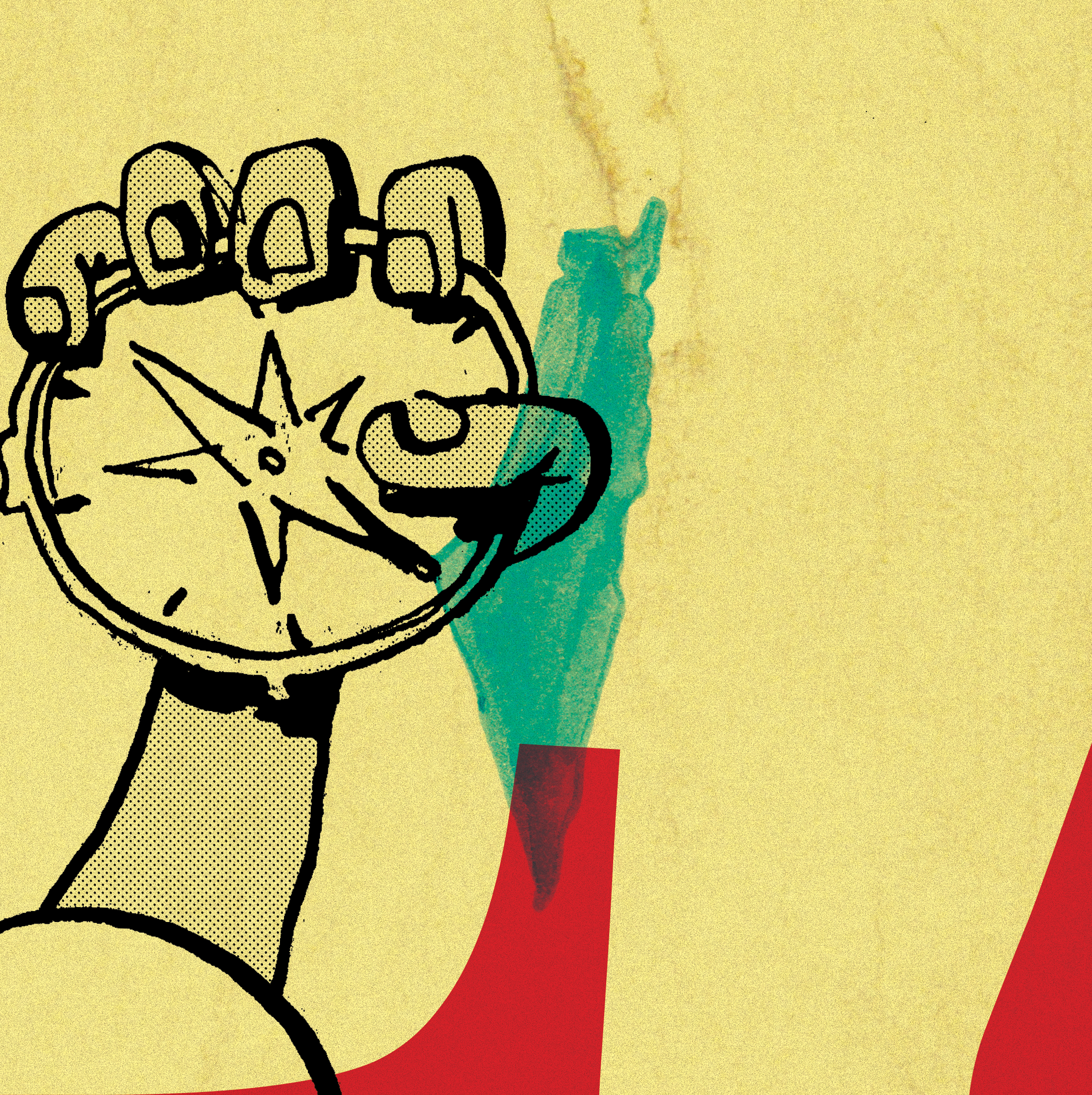
Album art for El Ärkitekt’s new album, BOOSALEH. Twelve images correspond to the album’s twelve tracks. When the images are stacked together in a 3x4 grid, the form one unified design that serves as poster art to promote the album’s release.
When El Ärkitekt approached me, he knew he wanted an image of Handhala holding a compass. Handhala of course being a recurring character in the political cartoons of famed Palestinian cartoonist Naji Al-Ali. The iconic character grew to become deeply associated with Palestinian struggle, itself being a core impetus behind El Ärkitekt’s new album.
The album is available to stream on Youtube, Spotify, Apple Music, Anghami, and Tidal.
Related Work
Ganzeer Rebrand
Branding
2024.09
Houston, TX
Ink, paper, and Adobe Illustrator
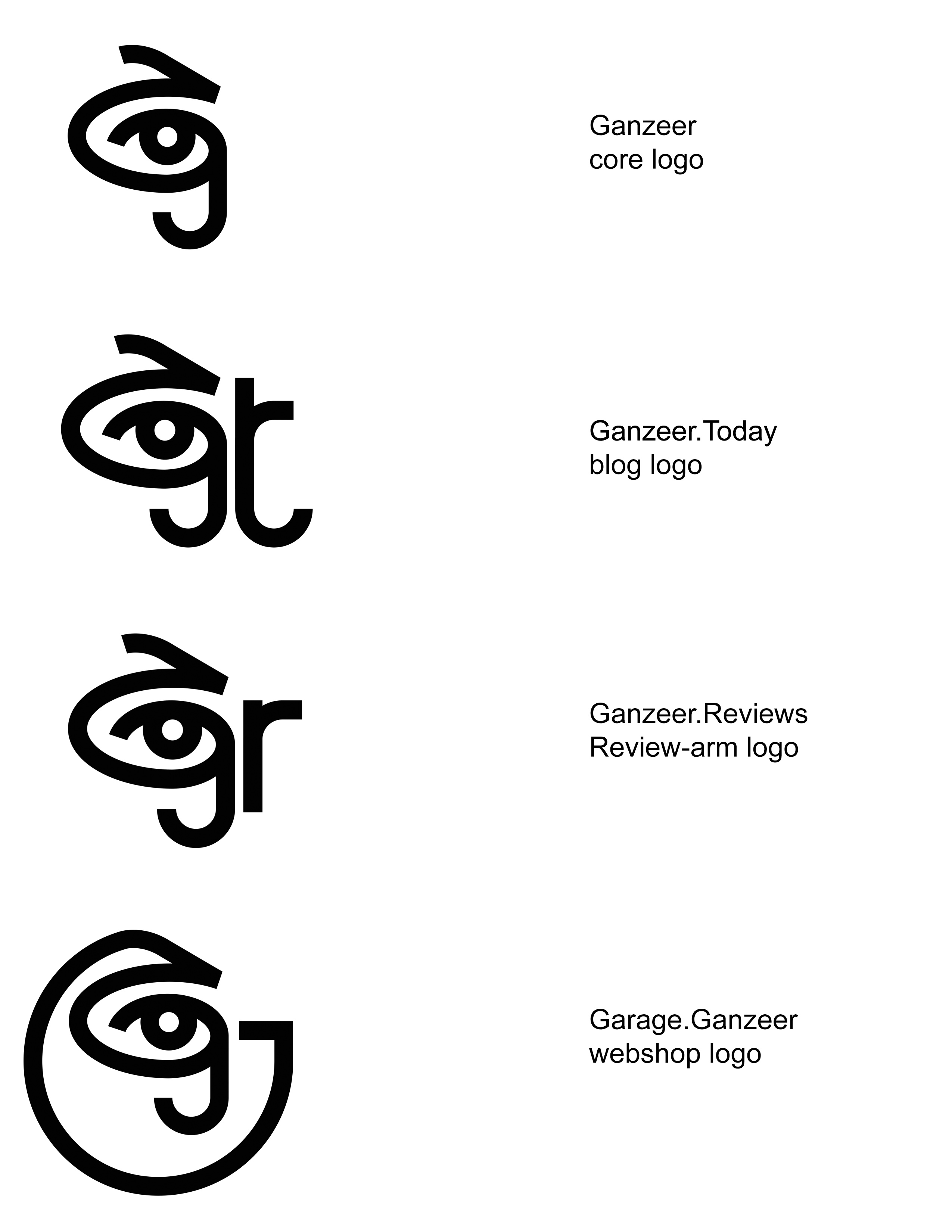
Aside from the obvious eye, the logo is also comprised of 3 letterforms (as was the previous one), G, J and the Arabic letter ج. The G being the first letter in Ganzeer of course, as the ج is in جنزير (Ganzeer in Arabic). The thing about the letter ج though is that it is only pronounced a hard G in Egypt and pronounced J in literally every other Arabic dialect. Which means جنزير will often be pronounced Janzeer when I'm in touch with Arabic speaks who hail from not Egypt, so the logo is able to represent all possible phonetics in one single symbol. It's as complex as it is simple.
The eye may be a cliche, but fact of the matter is everything I do—be it art, design, or writing—stems from one unshakable trait: observation. Keen, unwavering observation. Without which I doubt I'd ever have anything worthwhile to say. In any medium, really.
I've always been a fan of the kind of symbols you can't help but want to scrawl on your desk when you're a kid, and I think this logo has an element of that.
The earliest Ganzeer logos I conjured up tended to feature some graphic representation of a chain, because that’s what جنزير actually translates to. So it may seem to some to be a rather curious choice to not represent the chain at all in the latest brand iteration, but I’d like to think that as far as the word “Ganzeer” relates to me, it no longer carries any of its associations with the word chain, and has simply become a name associated with a person who engages in art design and storytelling.
Utilizing my signature together with the logo-form started to feel like a no brainer. Picasso’s signature was very much a part of his brand, as was Andy Warhol’s, as is the case with most visual artists. Why resist it?
Aside from the main dot com, there are three core channels of online activity that each needed a different enough logoform to signal it as its own thing, while still remaining very much related to the Ganzeer “identity”, and so an additional letterform was incorporated into each along the same parameters that informed the original composite glyph. An extra “t” for the Ganzeer.Today blog, an “r” for Ganzeer.Reviews, and a “G” for the Garage.Ganzeer webshop.
Related Work
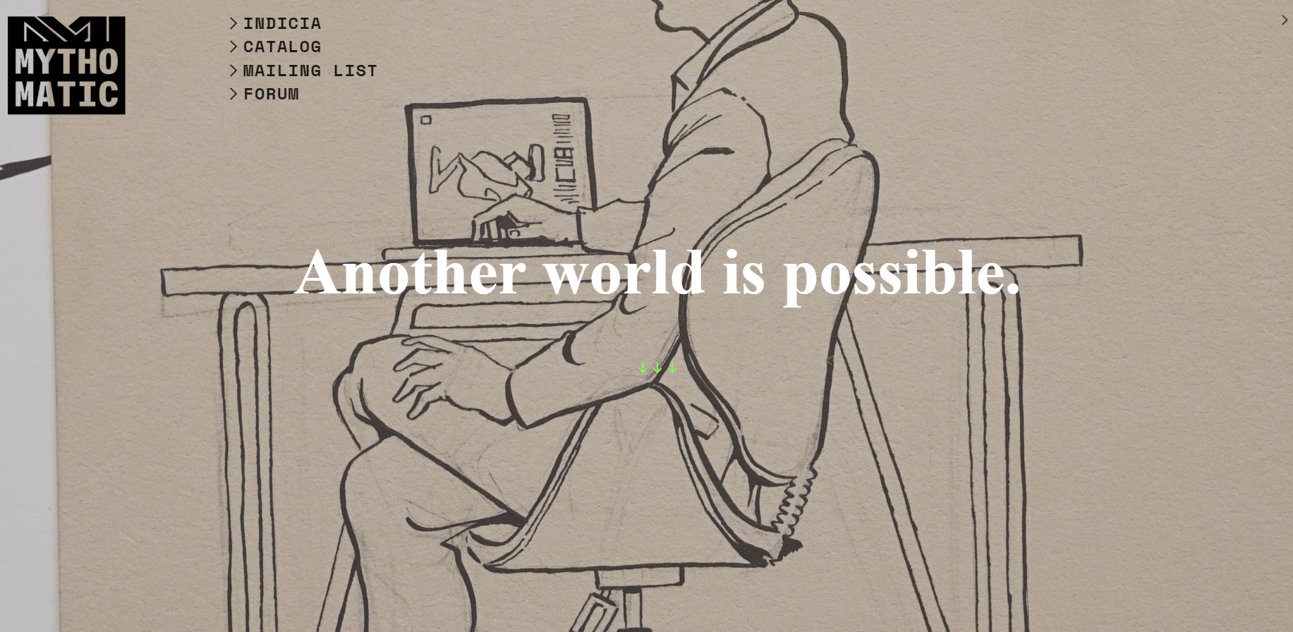
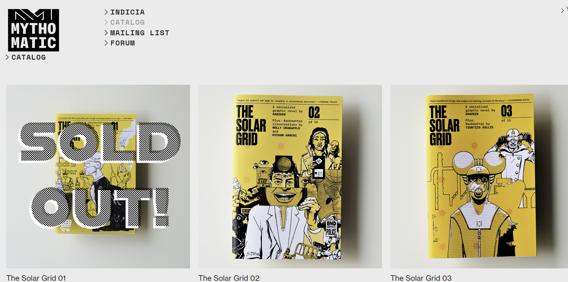
Mythomatic
Branding
2020
Houston, TX


Ink, paper, and Adobe Illustrator
The Mythomatic identity is built around a logo that captures the brand’s dual spirit of imagination and mechanism—its very name suggesting a “mythology machine.” As a boutique publishing imprint focused on narrative-driven works that fuse words and pictures, the visual identity needed to embody both the poetic and the systematic: a sense of story intertwined with structure, invention balanced with precision.
At the core of the logo are two interlocking letter M’s, representing the fusion of Mytho and Matic—myth and mechanism—two halves that together define the brand’s ethos as a myth-making machine. This symbolic “machine” serves as a visual metaphor for the imprint’s mission to consistently produce stories that function seamlessly between text and image.
The geometry of the M’s is clean, modular, and tightly engineered, reflecting the structural discipline behind bookmaking and design. Yet their interlocking symmetry introduces a sense of motion and cooperation—two components working in perfect unison, like the coordination between writer and artist, or between language and illustration. This subtle visual tension—between the organic and the mechanical, the mythical and the methodical—defines the brand’s graphic DNA.
Supporting the logogram is a monospaced typeface, chosen for its rhythmic steadiness and mechanical regularity. The fixed spacing of each character evokes the methodical beat of a typewriter or the even pulse of a production system, reinforcing the concept of a mythology machine at work. This deliberate typographic restraint allows the precision of the wordmark to contrast with the more dynamic interlocking symbol, creating a balance between expressive identity and functional clarity.
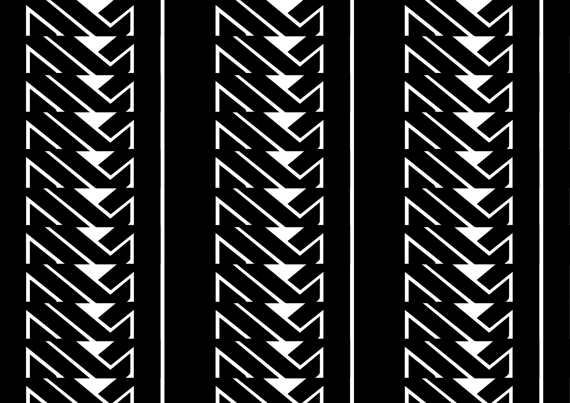
The logogram itself operates as more than just a brand mark—it is also a modular visual unit capable of forming powerful graphic compositions. When repeated, the twin-M emblem can generate continuous patterns and tessellations, producing a versatile visual language that extends across applications. These repeating motifs can be employed on merchandise, packaging, and promotional materials, transforming the logo into a pattern that signifies both repetition and creative production. In this way, the identity system reinforces Mythomatic’s conceptual core: the steady output of mythic narratives through a deliberate, almost machine-like process.
The branding maintains a minimalist monochromative palette that emphasizes the very form of the logomark. The stark geometry of the interlocking M’s benefits from the clarity of monochrome applications, allowing the mark to appear equally effective whether embossed on book covers, screen-printed on tote bags, or displayed digitally. The resulting impression is one of timeless graphic precision—an identity that feels both contemporary and rooted in the mechanical history of publishing, from letterpress to digital output.
Ultimately, the Mythomatic logo is an emblem of narrative production itself. It celebrates the beauty of systems and distills it into a simple, memorable visual form. With its interplay of symmetry and rhythm, its machine-inspired logic, and its capacity to generate visual patterns from a single sign, The Mythomatic identity captures the brand’s purpose: to craft art-driven stories through a process that fuses creative discipline with mythic ambition.
Related Work
Kamilia
Branding
2024—2025
Houston, TX—New York, NY


Ink, paper, and Adobe Illustrator
Kamilia is a luxury perfume and jewelry brand named in honor of the client’s mother. From its inception, the design process sought to establish a visual identity that would convey the brand’s deeply personal origins while communicating the refined craftsmanship behind its products. The earliest creative direction centered around transforming the mother’s handwritten signature into a bespoke logoform—an intimate gesture that would embed sentiment directly into the brand’s DNA. This approach was envisioned as a way to humanize the identity and give it an immediate sense of authenticity, making the brand feel as hand-touched and genuine as the artisanal goods it represented.
However, when it became clear that neither the client’s handwriting nor her mother’s signature possessed the aesthetic consistency necessary for adaptation into a polished mark, the design vision evolved toward a more typographic solution—one that could preserve the essence of personal handwriting without its imperfections. The typeface Kaileigh 2 was chosen as the foundation for this refined direction. Known for its graceful curvature and organic pen-like motion, Kaileigh 2 carries a believable sense of handcraft while maintaining typographic precision. A lightly customized version was developed to enhance rhythm, flow, and balance, resulting in a logo that feels both intimate and composed, reflecting the dual spirit of Kamilia: personal yet refined.
Complementing the logotype is a custom logomark derived from the natural geometry of the Camellia flower—a subtle nod to the name’s botanical counterpart. The form elegantly abstracts the petals of the flower into a free-flowing symbol that simultaneously outlines the letter K, allowing the mark to function as both an emblem and an initial. This layered meaning adds depth to the brand’s visual storytelling, merging nature, femininity, and identity in one continuous line. The result is a mark that feels organic and deliberate, mirroring the sensual, crafted nature of the perfumes themselves.
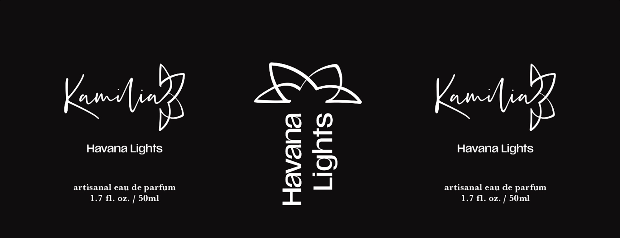
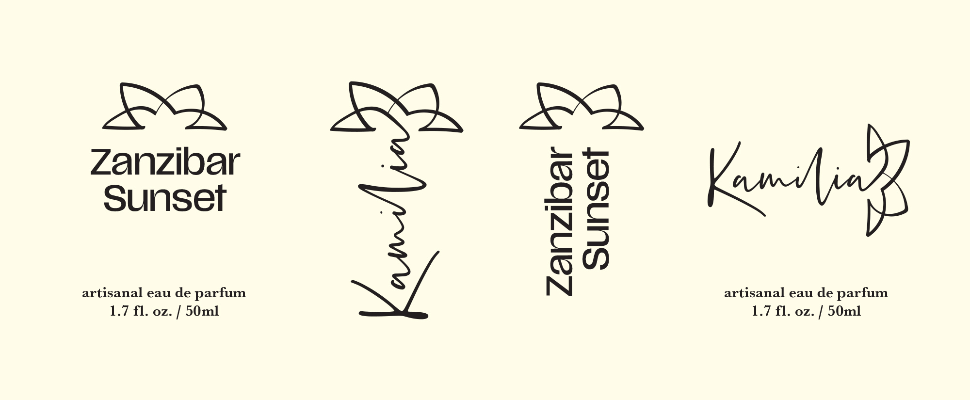
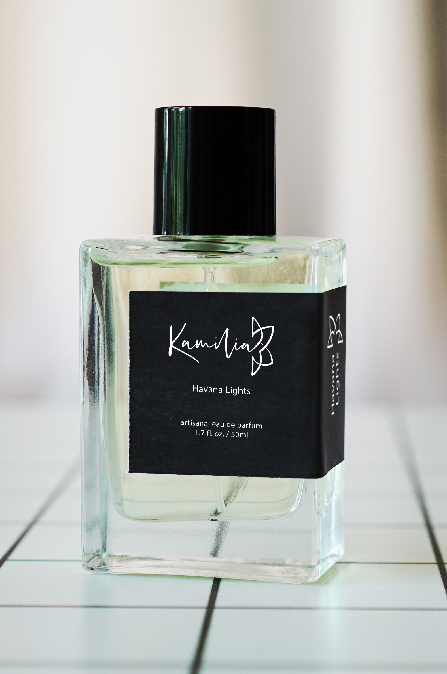
The broader identity system rejects conventional gender labeling—Kamilia does not divide its scents into categories of “for men” or “for women.” Instead, design and color perform that communicative role. The unisex fragrances are identified by white-on-black labels, emphasizing neutrality, graphic minimalism, and a universal sophistication that transcends gendered marketing. In contrast, women’s fragrances adopt a black-on-off-white palette, paired with a more expressive six-sided bottle capped by a bold circular lid. This cap’s smooth geometry and luminous surface introduce a sense of ornamentation and visual drama, contrasting the cleaner, more architectural form of the unisex bottle. Together, the two systems create a dialogue between restraint and exuberance—between quiet luxury and expressive femininity.
Although both bottle designs are mass-produced and widely available, Kamilia’s visual identity transforms their mass-produced forms into something distinct. This transformation is achieved through the label design, which wraps around the bottle’s side rather than sitting symmetrically on its front. The wrap introduces a deliberate asymmetry that breaks from standard perfume packaging conventions, giving each bottle a confident sense of motion and individuality. Beyond its aesthetic impact, the wrapping technique provides a functional advantage: the label remains visible when bottles are arranged side by side, echoing the readability of spines on a bookshelf. This practical yet poetic detail ties into the brand’s underlying philosophy—beauty through thoughtful design.
Typography plays a critical role throughout the identity. While the Kamilia wordmark carries the intimacy of script, the scent names employ Scale VF, a highly flexible variable sans serif chosen for its combination of elegance and clarity. Scale VF’s large counters ensure legibility from a distance, while its dynamic weight range introduces a rhythm reminiscent of calligraphic thick-and-thin strokes. The resulting interplay between Kaileigh’s handwritten grace and Scale VF’s modern geometry produces a sophisticated visual contrast—one that underscores Kamilia’s dual identity as both artisanal and contemporary.
Every design decision—from the curve of the K to the balance of ink and space—was guided by the goal of expressing Kamilia’s essence: refinement without pretension, sensuality without excess, and craftsmanship elevated through simplicity. The final identity system achieves a harmony between personal history and modern sensibility, allowing the brand to inhabit a space that feels both exclusive and emotionally grounded. Through typography, form, and material choice, Kamilia communicates not only luxury, but also intimacy—the quiet story of a name carried forward through conscious design choices.